UH Tableau User Group
Abstract
We are excited to announce our UH Tableau Users Group to support, share ideas, and learn from those who are working with Tableau on the UH campus. In our first meeting, we will review current UH Tableau deployments, discuss UH branding, color palettes, and how to publish dashboards to a website.
Agenda
- Welcome from the Director of Institutional Research at UH
- Explore current deployments of Tableau at UH
- Learn how to incorporate UH branding aesthetics
- Publish dashboards to server
- Display dashboards on a web page
- Complete an interactive activity
Tableau at the University of Houston
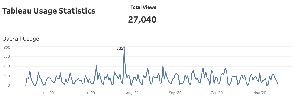
We first adopted Tableau as our data visualization software back in 2016. Since then, we have implemented approximately 24 dashboards to facilitate decision-making at UH. During a six month period between May and November 2020, we have amassed over 27,000 unique dashboard visits!
UH By the Numbers
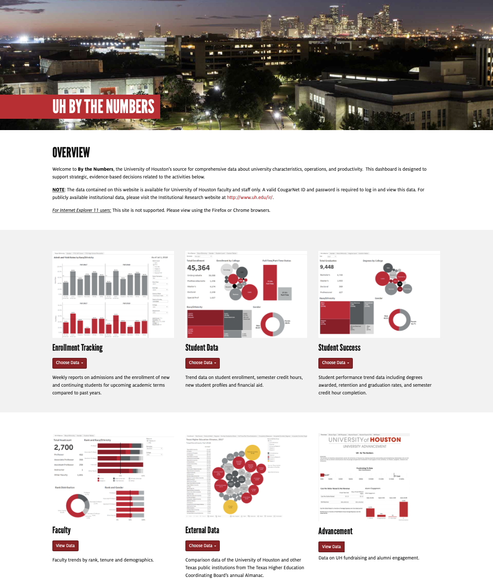
UH By the Numbers features 18 dashboards restricted to faculty and staff use only. You must log in with your Cougarnet credentials to access these dashboards. They are organized into these categories:
- Enrollment Tracking: Weekly reports on admissions and the enrollment of new and continuing students for upcoming academic terms compared to past years.
- Student Data: Trend data on student enrollment, semester credit hours, new student profiles and financial aid.
- Student Success: Student performance trend data including degrees awarded, retention and graduation rates, and semester credit hour completion.
- Faculty: Faculty trends by rank, tenure and demographics.
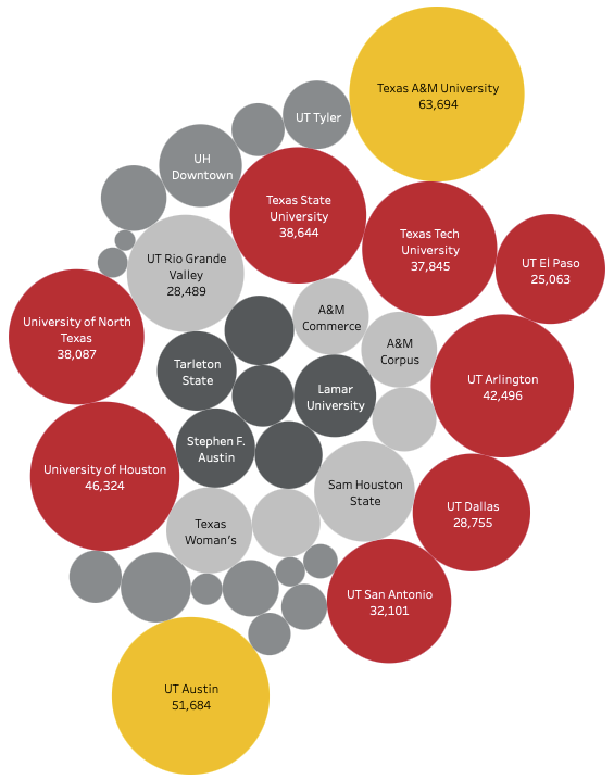
- External Data: Comparison data of the University of Houston and other Texas public institutions from The Texas Higher Education Coordinating Board’s annual Almanac.
- Advancement: Data on UH fundraising and alumni engagement.
UH Statistical Handbook
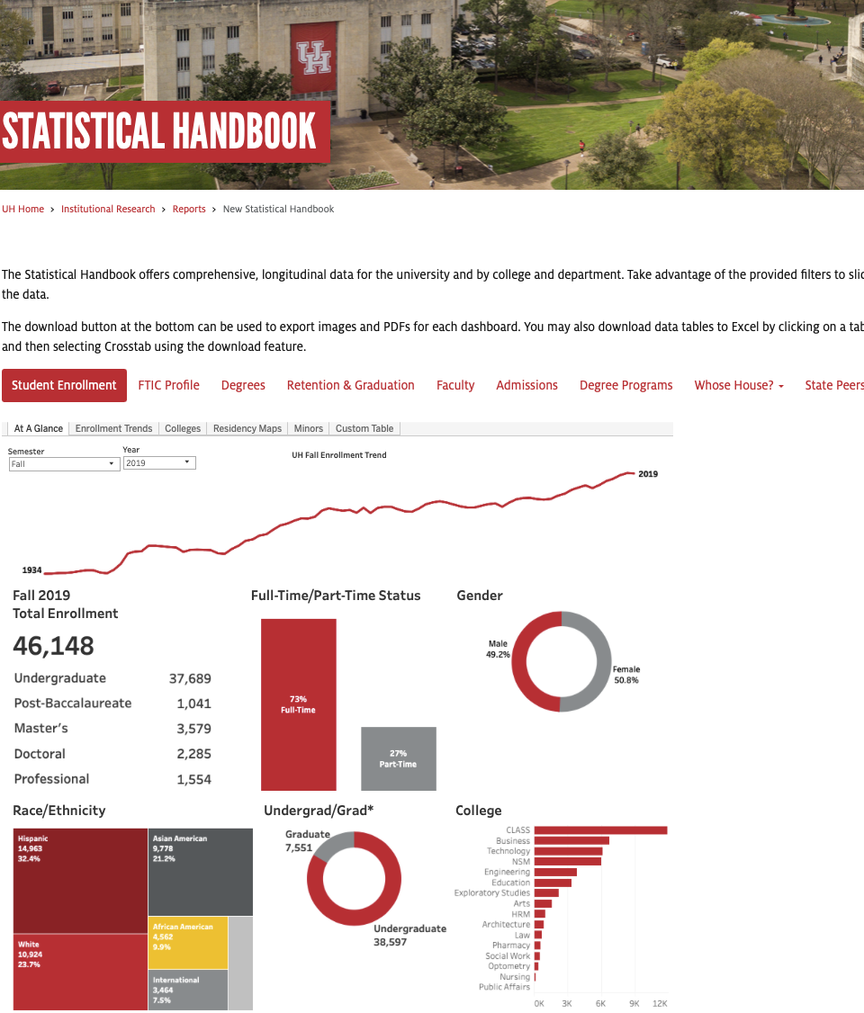
UH Statistical Handbook transforms our original handbook reporting into interactive dashboards. The Statistical Handbook differs from By the Numbers in the following ways:
- Anyone can access data in the Statistical Handbook - no log-in required.
- Statistical Handbook offers more flexibility and more levels of detail. For example, you can see all racial and ethnic breakdowns that are collapsed in By the Numbers (e.g. Hawaiian/Pacific Islanders are collapsed into Asian American on BTN).
- Statistical Handbook provides more information than UH By the Numbers including data on minors, degree programs, and geographic data for students.
UH Branding

It is important that all Tableau dashboards displayed on any university web page have the same look and feel as the overall UH site. Fortunately, University Marketing and Communications outlines various branding guidelines to help you publish dashboards with the Cougar aesthetic.
Color Palettes
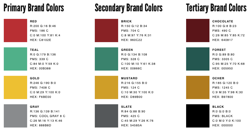
Tableau desktop comes with many great color palettes to choose from. In this section, I will show you how to manipulate Tableau’s preferences file to incorporate UH colors to your dashboards:
- Find your “My Tableau Repository Folder.” At installation, Tableau usually saves this under your Documents folder on your hard drive. For example, on a Mac it is under “Macintosh HD/Users/user_name/Documents/My Tableau Repository” and on PC it is usually found under “C:/Users/user_name/Documents/My Tableau Repository”.
- Make a copy of the “Preferences.tps” and call it “Preferences copy.tps.” We make a copy of this file just in case anything goes wrong.
- Download the Preferences.tps file we created and save it in your “My Tableau Repository” folder. This will contain all the branding colors for you to use on your dashboards.
- Close and restart Tableau Desktop. You should now see UH color palettes!
You may also want to use your own colors. I recommend using Color Brewer. This website helps you pick among sequential, diverging, and qualitative colors. You can also select among colorblind safe, print friendly, and photocopy safe colors. These colors are geared towards cartography, but they are great guidelines for any color use!
For more tips on using color and dashboard design, see this presentation a colleague and I gave on Visualizing Assessment Data in Tableau.
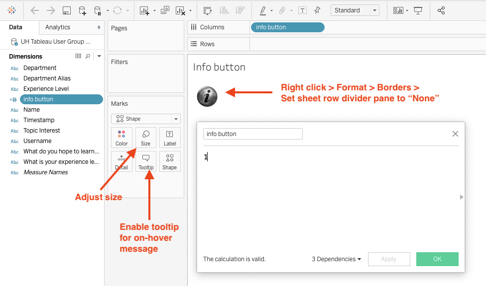
Info Button
Sometimes you need to include some context to your dashboards. Enter the handy info button!

The info button can be incorporated to any dashboard to give your users more detail about the data they are seeing. We use the info button above. Feel free to right click and save the image above for your dashboards.
If you want to include a different info button or any other image of your choice, I recommend using an .PNG image with a transparent background. You can tell if the image has a transparent background if it has a light checkered background like the one below:

Here are the steps to include an info button - or any shape - to your dashboards:
- Save you image in your My Tableau Repository > Shapes folder. It can go under the main Shapes folder or create your own folder.
- In Tableau Desktop, create a new calculated field for the info button. Call the field “info button” and give it the value “1” (see image below).
- Convert “info button” from Measure to Dimension. Then drag the field onto Columns.
- Increase info button using Size on the Marks card.
- Remove default formatting and set sheet row divider pane borders to “None.”
- Add information to your info button using the Tooltip.
- Place info button worksheet onto dashboard.
Publishing
It is now time to publish your hard work for the world to see!
- Go to Server > Publish Workbook on the menu bar. Make sure you are logged-in.
- Select your project folder. I recommend starting with your WIP (work-in-progress) folder before moving to your production folder.
- Give your workbook a name - it can be different from your workbook file name. Be careful: you could overwrite a similarly named workbook! But this is helpful if you are updating the same workbook.
- Add an optional description.
- Select the sheets/dashboards you want to display. Tip: select “Show sheets as tabs” to enable the tab navigation at the top of your dashboards.
- Publish.
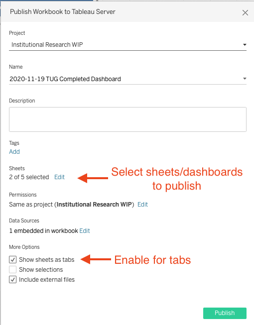
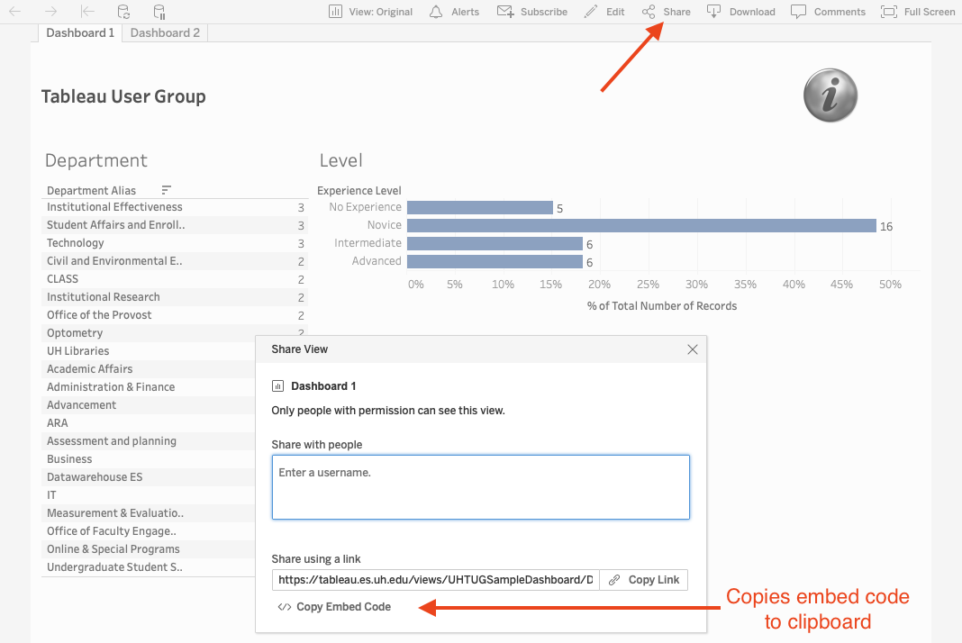
Tableau will automatically open a browser with the location of your published workbook. This is where you can find links and embed codes:
Links can be used to share your workbook with others who have access to your publishing folder. It leads them straight to Tableau Server. Do not use this for displaying your dashboard on a web page.
The embed code is what you need for publishing to a web page. Go to Share at the top of your screen to access the embed code:
Placing Your Dashboard on a Webpage
If you do not have access to publish web pages using UH’s Content Management System (CMS), you will need to share your embed code with your web administrator to make your dashboard live on your website.
If you have access to publish to your website, take your embed code and place it into the body of you web page. Here is an example:
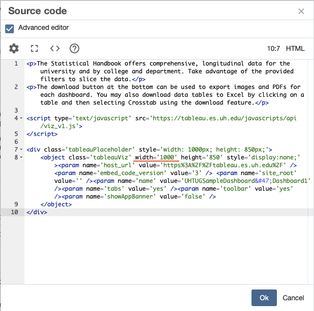
The embed code is shown in lines 4-10. Line 4 is a script that is pulled from Tableau Server. This script tells the web browser how to render your dashboards on the web page.
The following div creates a container with set dimensions for your dashboard to display on the web page. For most users, you do not need to change any of these elements. However, if you want your dashboard to display full width, you can replace the width='1000’ with width='100%'.
Tableau dashboards are by default responsive in that they adjust to the display medium (desktop computer monitor, laptop, smart phone, tablet, etc.). However, you can set the dimensions of your dashboard to be specific to devices. These settings can be found on Tableau Desktop when you create a new dashboard under dimensions.
Activity
Explore our Tableau dashboards for yourself! We challenge you to a scavenger hunt which can be found here. Click here for the solutions.